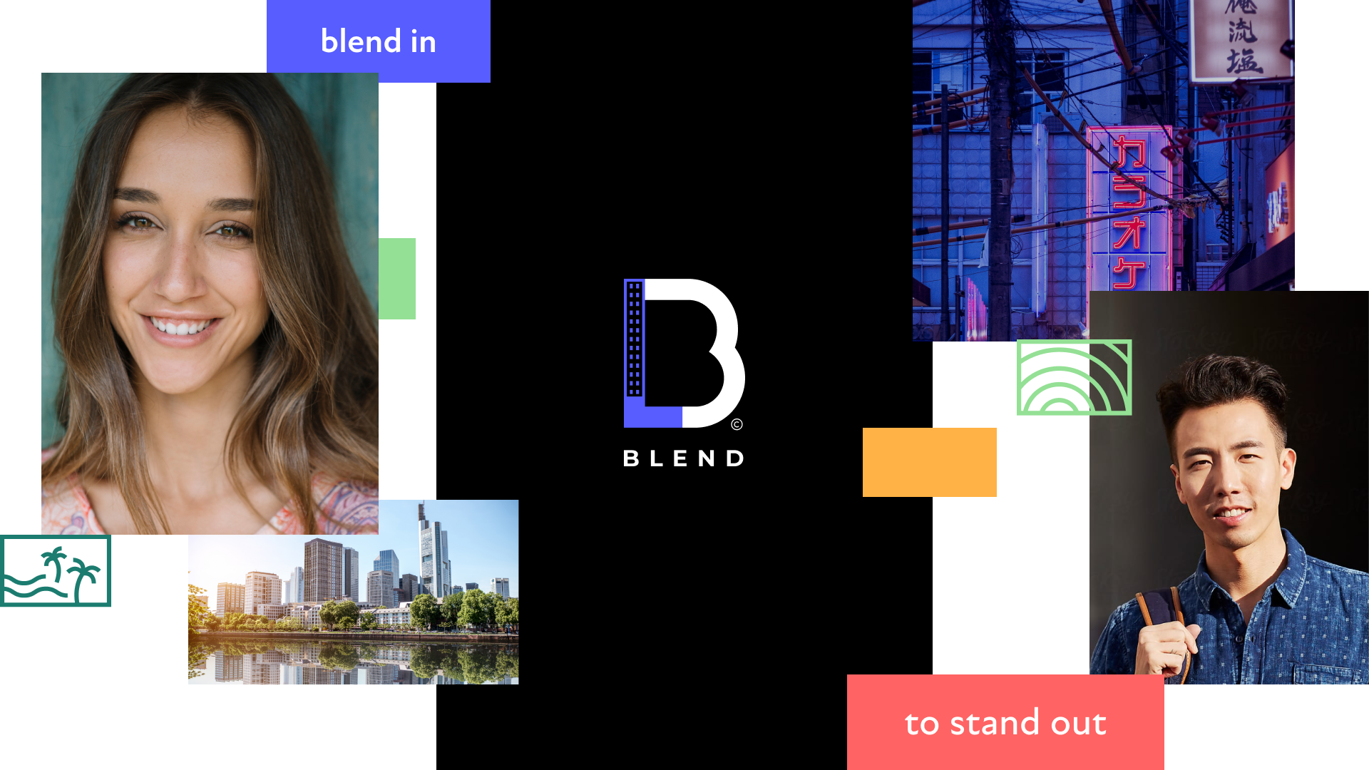
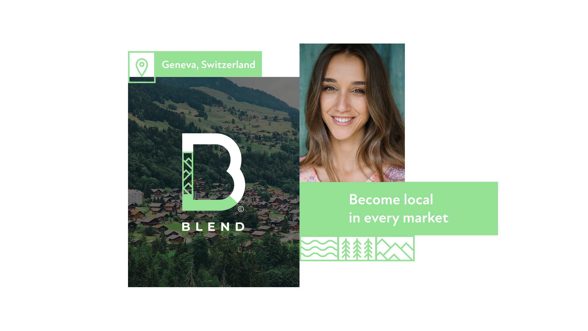
The ‘glocal’ economy is thriving. Thousands of once economically independent communities are today embedded in and reap the benefits of a common global economy. International brands seeking to truly stand out globally, must now first blend in locally. At BLEND, their mission is to aid global brands in achieving exactly that. This is our branding for them.
Blend started its way with an online platform that offers rapid-translation services under the name One Hour Translation. With the company's growth, its offerings evolved and included many more services alongside One Hour Translation. Because of that, the company's brand strategy needed to adapt to reflect that evolution. The brand’s essence shifted to one that’s natively local - acknowledging, respecting and empowering the native culture, language and meaning and from that shift BLEND was born and it’s essence - To blend in, is to stand out.
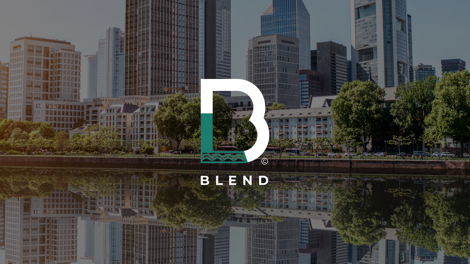
To reflect Blend’s expertise in adapting brands to perfectly suit new markets, the brand uses a modular logo which 'blends' into different cultures and industries.
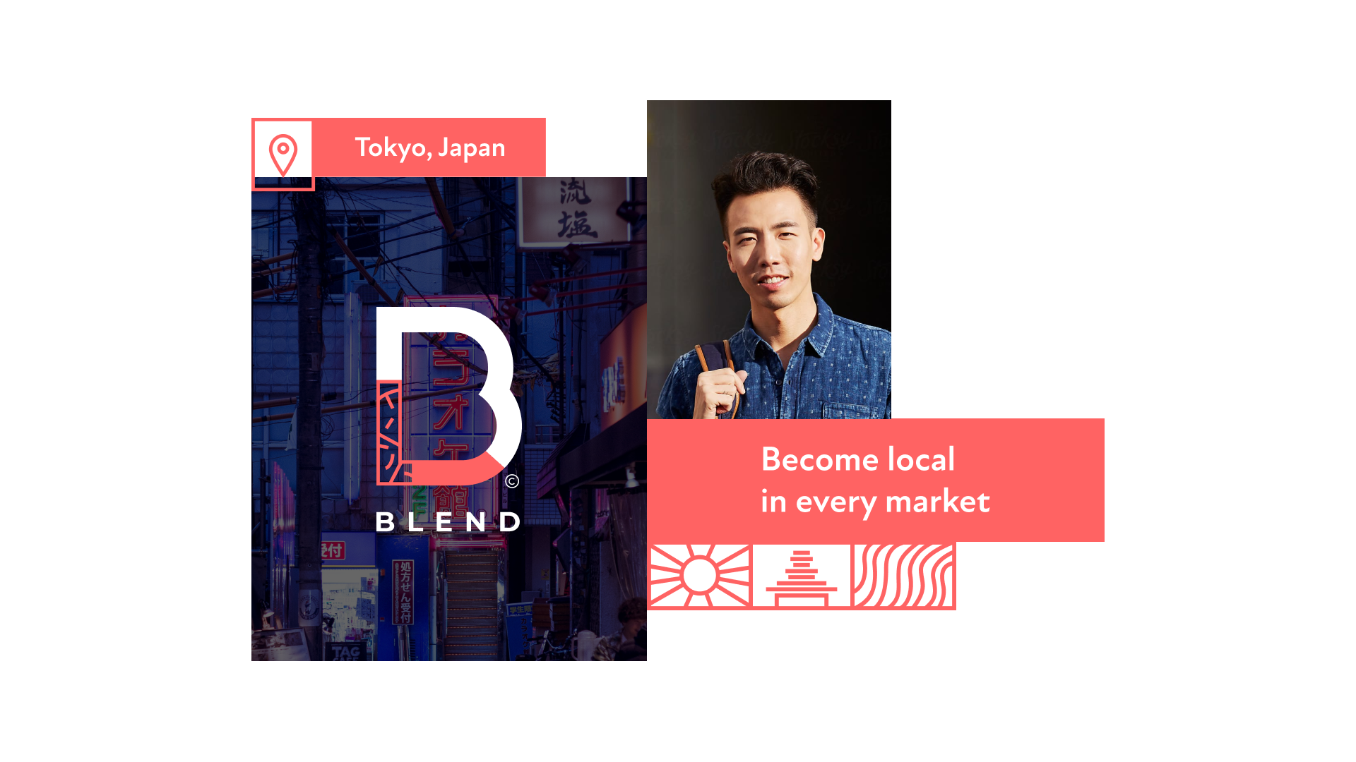
The core part of the logo remains black or white (dependent on the background) but an additional colour and pattern is used to incorporate elements from different parts of the world.
We defined a set of sub-logos that represent the different industries.
We divided the colour palette into two -
The primary colours chosen for the brand are black and white - neutral colours that ‘blend’ easily - and serve to support the main brand elements.
The supporting colours serve to insert a sense of different cultures and locations into the world of Blend.
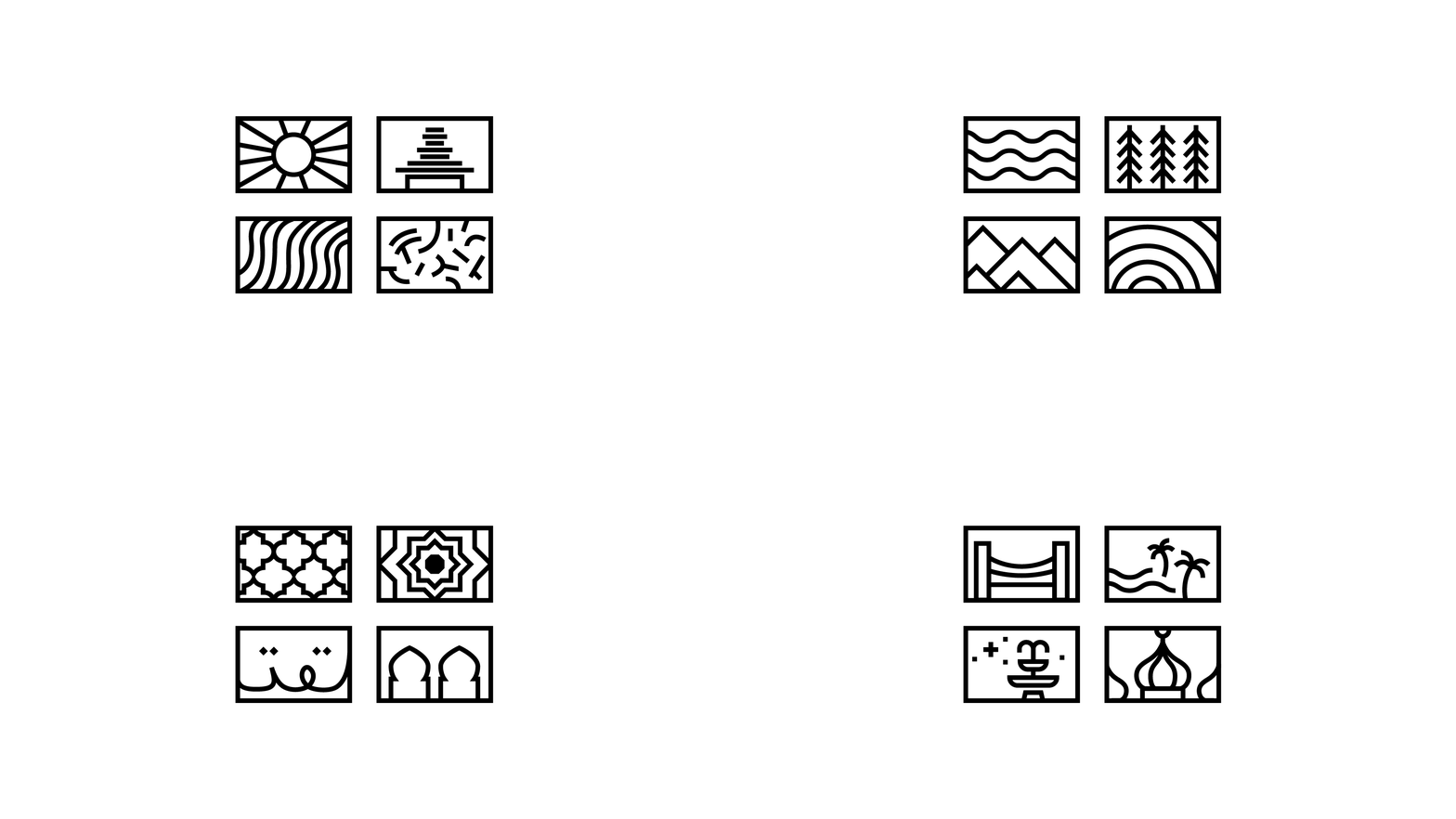
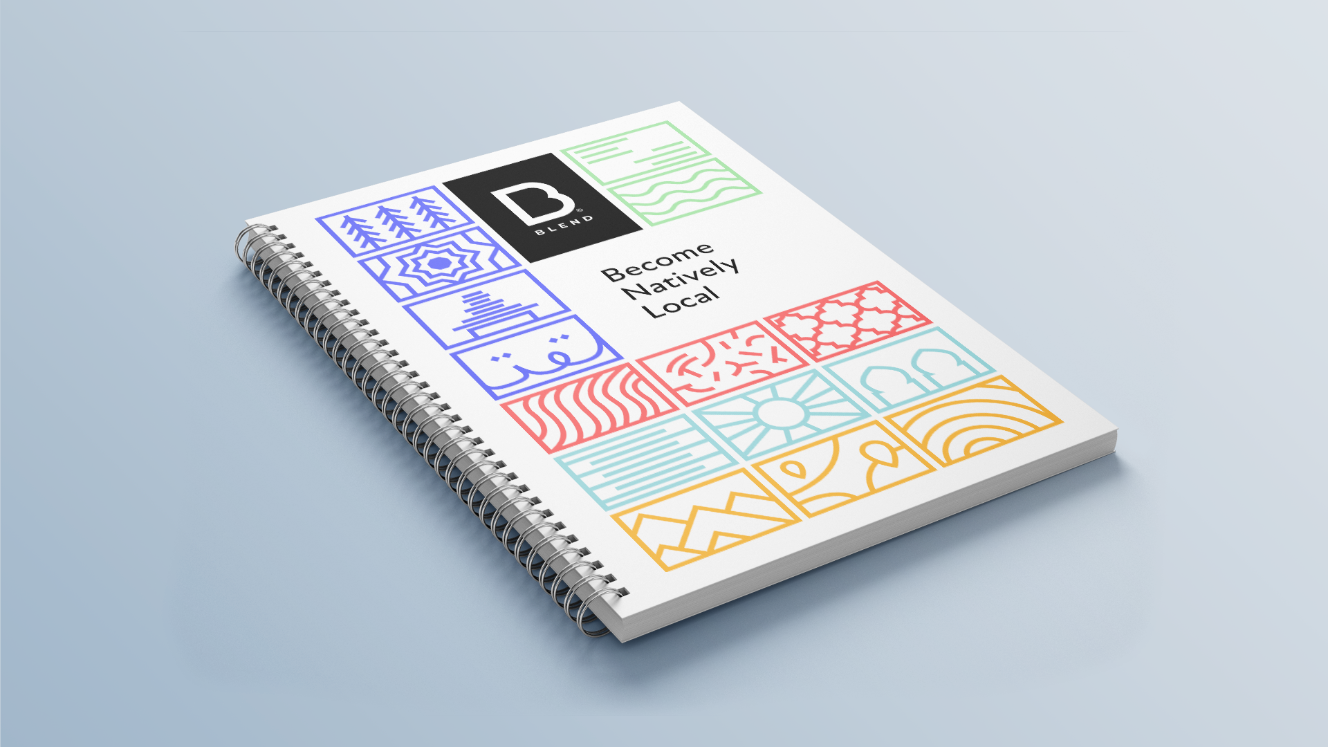
The icons are based on building blocks and are split into culture icons and category icons.
The culture icons represent the different textures and layers of a culture, and when placed together they build up to make sense of what the place is about.
The category icons include informative and descriptive icons to accompany different
headlines.
The photography within the Blend brand has a natural feel, bringing together eclectic cultures from around the world.
When showcasing people, we chose images of locals that look both professional and approachable. It was important that we show a broad spectrum of people from around the world but in a tasteful way which is not a stereotype.
When focusing on different parts of the world, we chose to focus on the more everyday sites locals might encounter, as opposed to famous landmarks and attractions associated with the country in order to get a “taste” for what it is like to actually live in that region.
We combined the different elements into mood boards that offer a “taste palette” representing the different cultural offerings from each country.
The website for Blend incorporates mood boards of icons, imagery and typography to organise all of the content in an interesting and engaging way. We created animation for the homepage header to showcase the various cultures Blend is associated with.
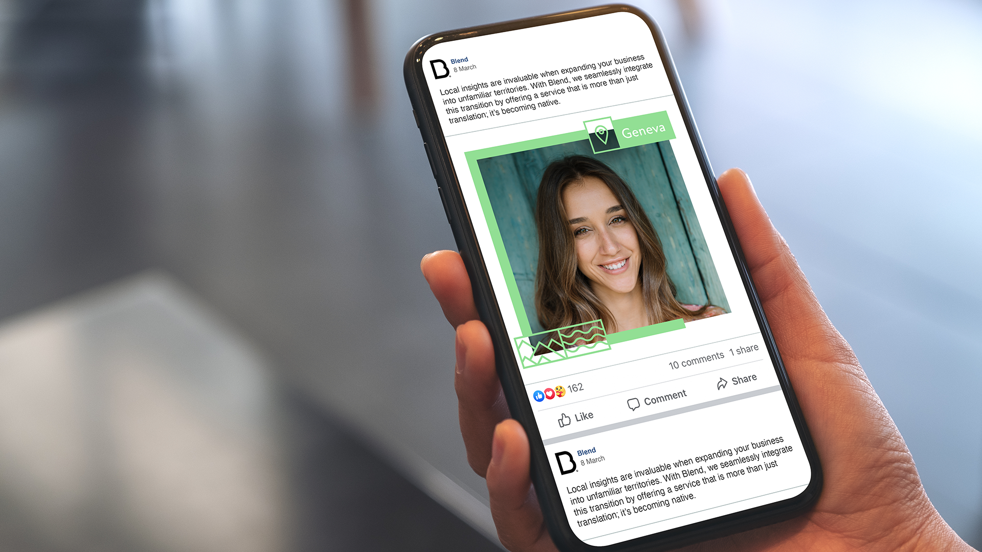
Other deliverables included work on social media templates, office swag and more.