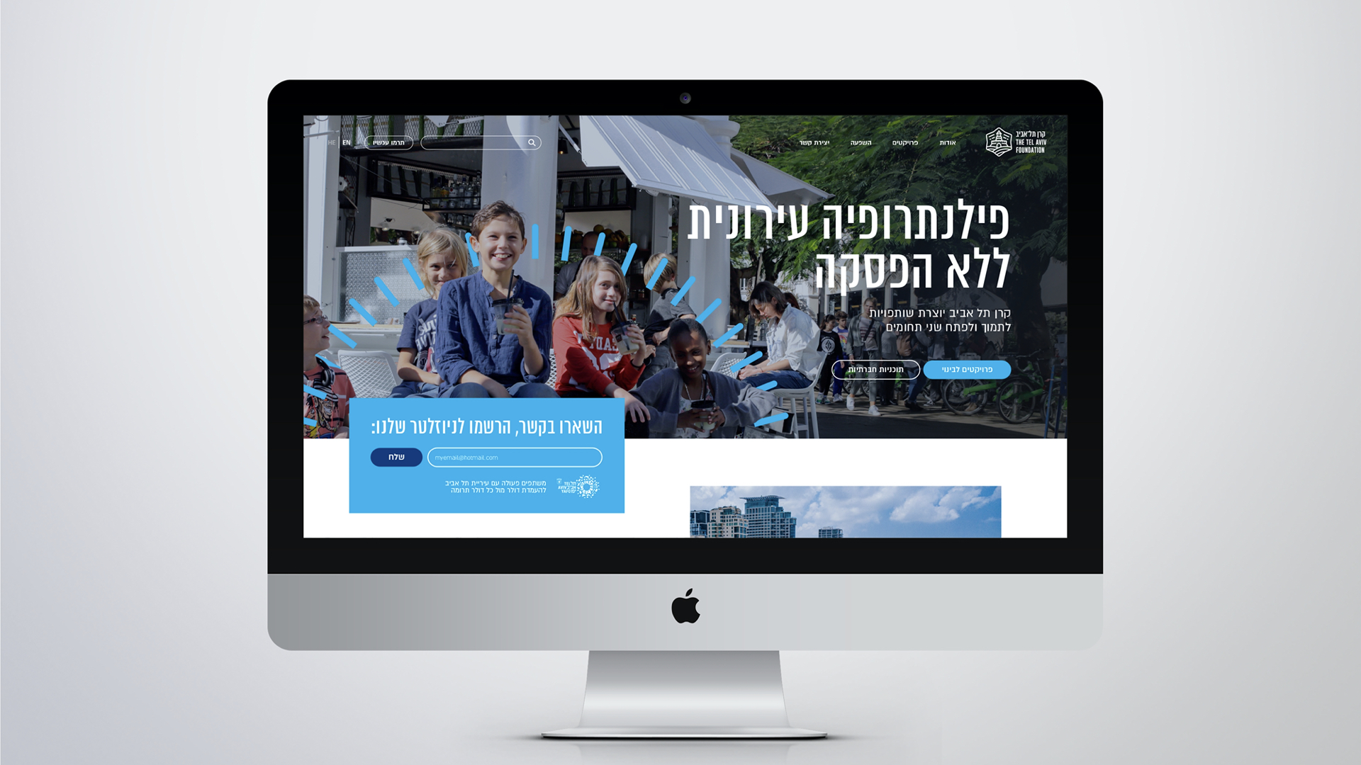
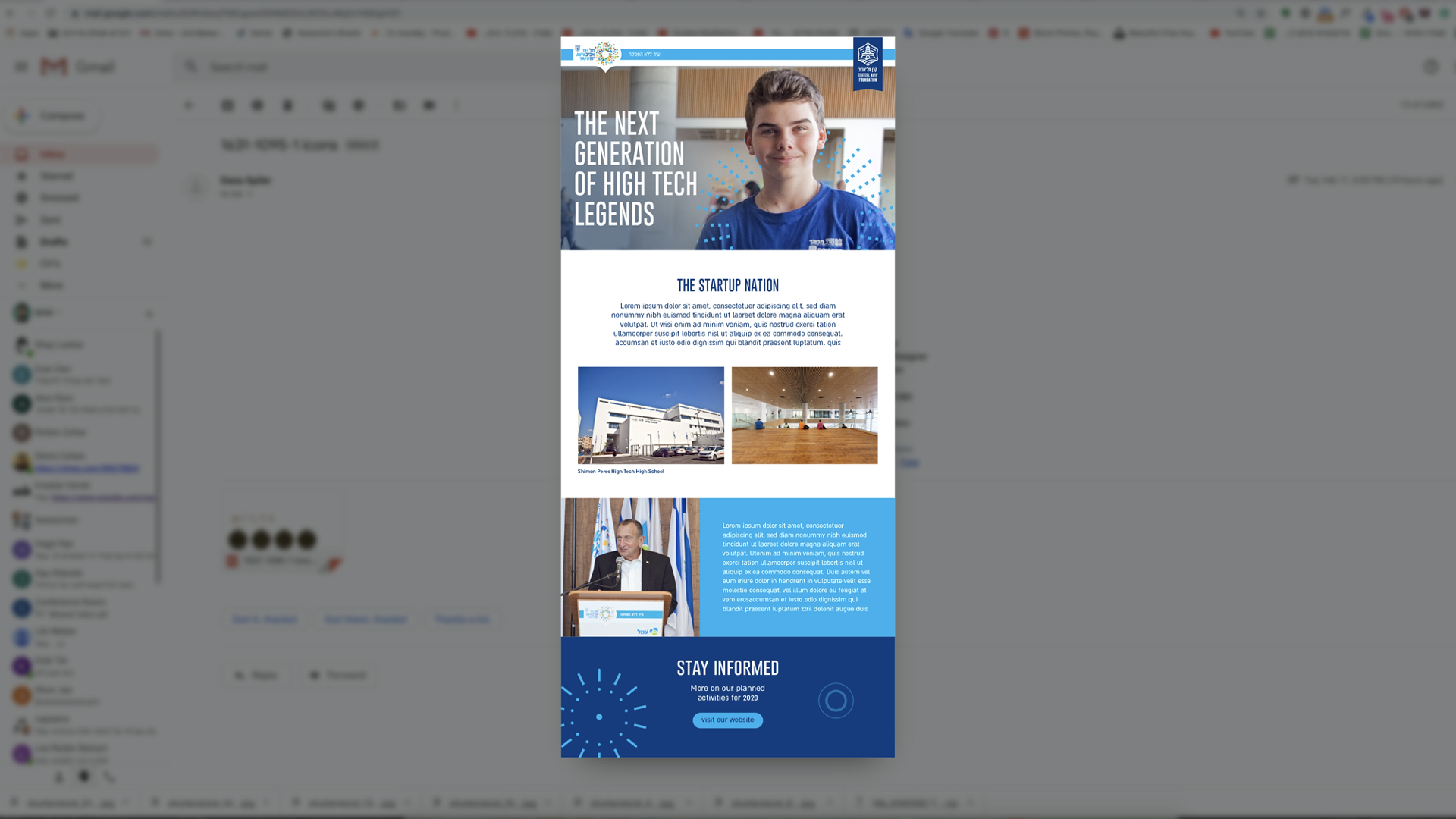
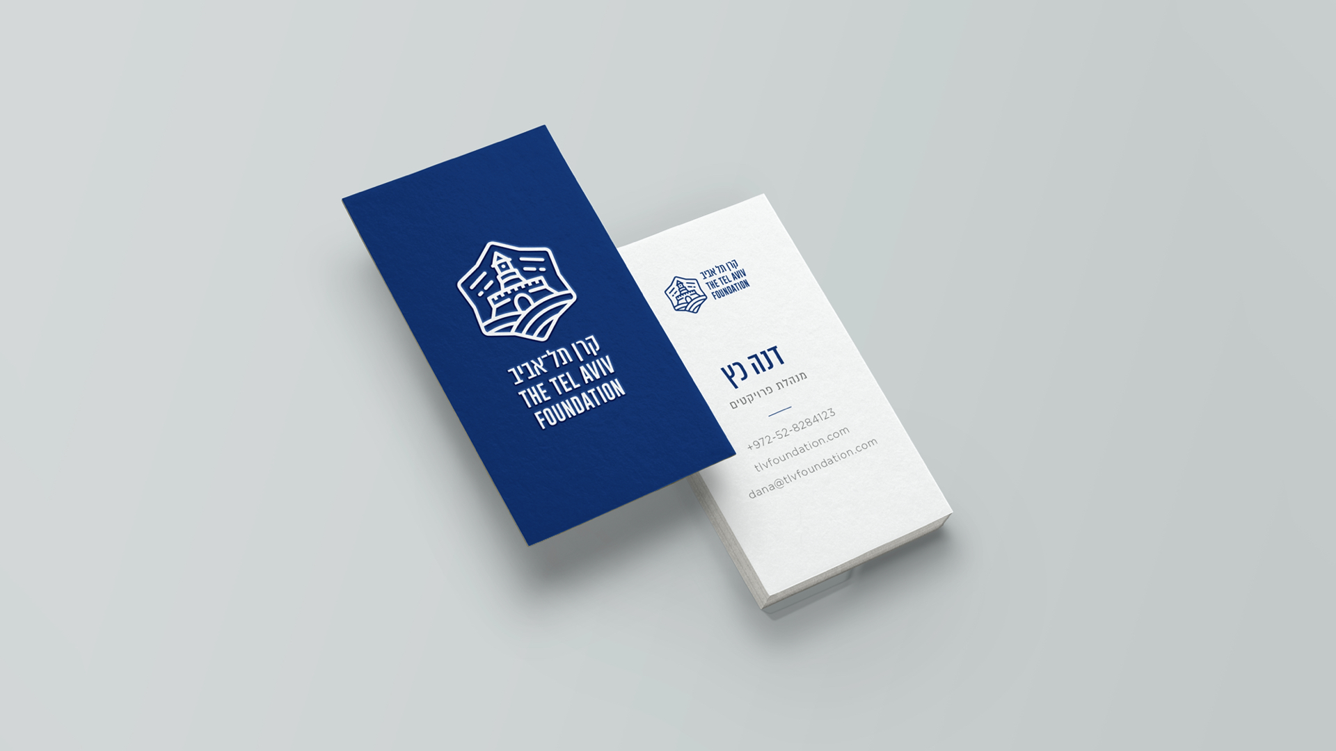
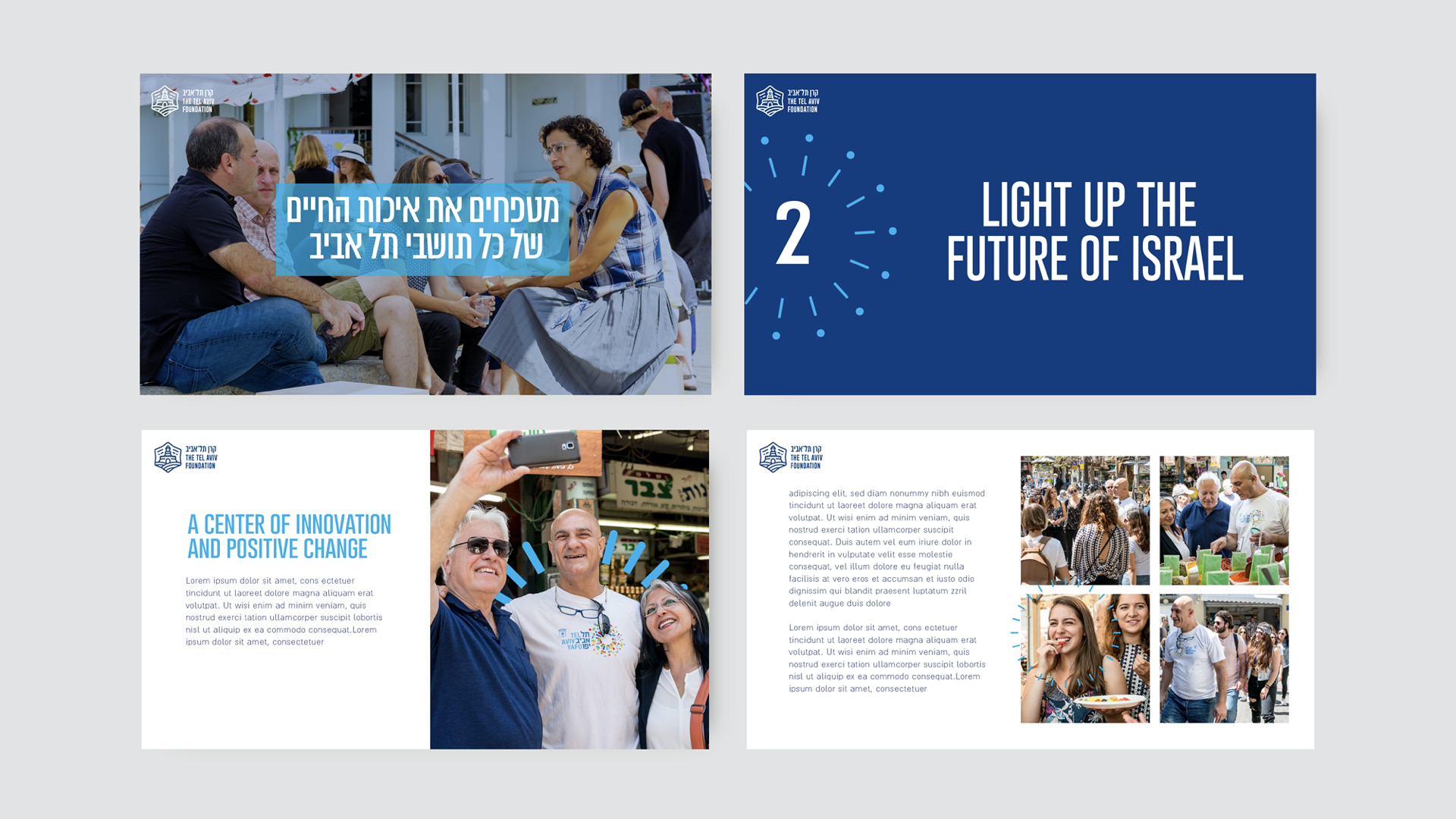
How do you take a 40 year-old urban development foundation and make it feel as modern as Tel-Aviv? That was the challenge when working on rebranding The Tel-Aviv Foundation. The foundation, which helps funnel potential investors into the city of Tel-Aviv, went through a visual transformation which included an updated logo, a new photographic language and various brand elements. Check it out.
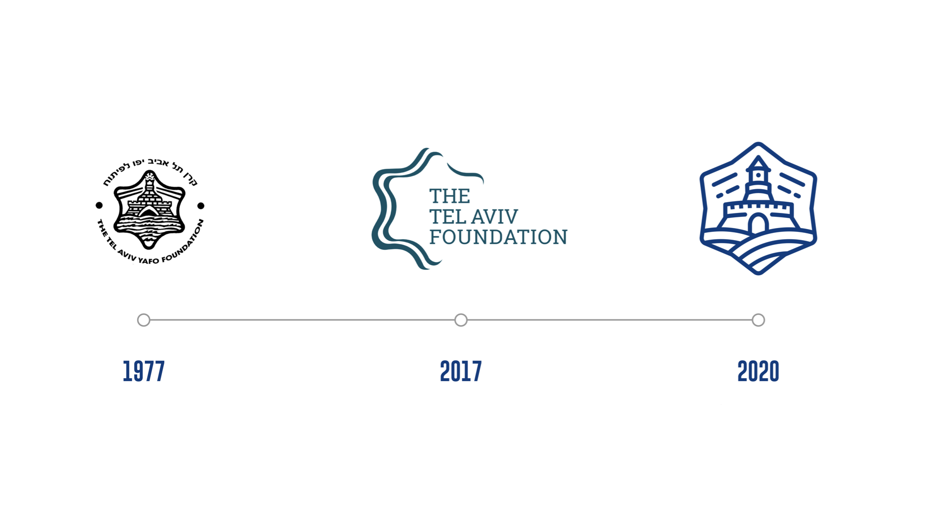
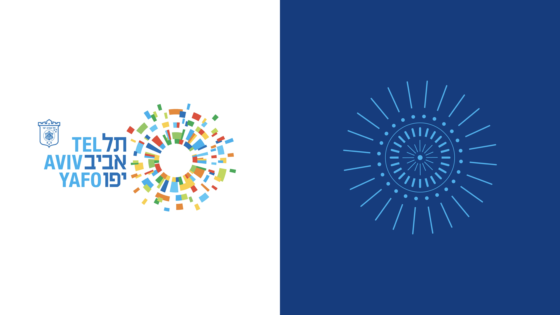
The Tel Aviv Foundation first opened in 1977 using the logo originally painted by the artist Nahum Guttman in 1925 for the city of Tel-Aviv. In 2017 the foundation went through a rebranding process that omitted the lighthouse from the logo - leaving it with just the Star of David and the title. It was important for the Tel-Aviv Foundation to go back to its roots and use the original logo, which is where we came in - restoring the logo and bringing it forward to the 21st century.
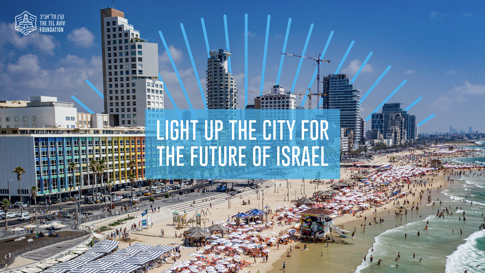
The goal was to give a visual expression to the light Tel-Aviv sends out to the Jewish communities throughout the world. We added graphic lines that symbolised rays of light bursting out of elements in various images from across the city. This was further emphasised by the accompanying messages, expressing themes of dreaming and achieving.